The Neutrals
After the group and I came up with the two different types of ghost. One hostile and on neutral, i.e. indifferent to the player, I realised we didn't have artwork of the latter to show the visual differences. I was aware that it would be vital for it to be immediatly obvious to the player what was a threat and what wasn't. It was the neutrals purpose to loop around a set path, acting out scenes from their past at certain intervals of that path. They therefore need to look human enough to communicate actions. Most of the time they would be faint. If the player looked at them for too long or even got too close, they would simply vanish. It was only at the times they were acting out these highly intense scenes that they could be viewed. They would get clearer, brighter even, and their voices would get less muffled and more audible. I therefore felt i should try to show both states of neutral.
The ghost I designed was based off of a ghost that lived in a pub close to my home in Canterbury called the George. Despite not believing in ghosts I still find these stories interesting. The pub had several fleeting owners on my frequent visits to it as a child (it was a family friendly country pub), some of which were believers and actually had exorcisms performed on the building, some were non-believers. They all, regardless of their beliefs, experienced at least the feeling of a "presence", some even claimed to witness the ghost. She was "The White Lady" a woman in her nighty wander what was once a much bigger building. I based her appearance off of some of the old photos showing ghostly white figures.
 |
| The Brown Lady of Raynham Hall, 1936 |
 | ||
| The neutral ghosts: Normal on the left, Emotional on the right | . |
After some discussion with the group I was assigned the task of designing the inventory. We had already agreed that Anne would keep all of the items she found in a tan leather messenger bag she carried around with her. I decided to create the inventory around these principals. I also knew that there were only 4 types of things Anne could collect: Batteries for the camera, and indication for which had already been designed by Jack, Film, Puzzle items and Combo items, which attach to combination film.
As such I created seperate areas for each. I also wanted it to look as though she was looking into her bag. Based on this principal I thought it suitable to have the items in a line with a circle around the selected item. The items would fade out and get smaller as they moved away from the circle. This gives the impression that they are disappearing into the bag. I have designed the information box at the bottom of the box to look like a piece of torn notebook paper since the other menus are all based in a journal Anne carries around with her.
 |
| My design for the inventory. Background provided by Jack |
The piece was all drawn with little reference needed. I drew mainly from intuition. The only problems I have with it is the general roughness of it and the cartoony shades of colour. I feel like these could have been desaturated and even given a hint of blue to go with the gloomy cold feeling of the rest of the game.
Mansion
I originally intended to have the backing for the Design Doc to look like the scrappy notebook Anne carries throughout the game, the group disagreed, however, and I was instructed to create a scene which could have the opacity lowered.
I thought, since the Mansion is the primary incentive for the player and it had not yet been designed, I should maybe produce a scene with the Mansion in it. Not being great at drawing buildings I needed a fair amount of reference. I thought about how the village was supposed to have survived for centuries. The village was also the scene for a horror game so had probably seen some pretty horrible history. Many of the locations in horror have history beyond their main story. I figured that it was probably a castle at one point belonging to a land baron at some point. I also then found that British castle architecture just isn't that scary. I decided, since we weren't going for an entirely realistic approach to sneak in a little of Reichsburg castle into the central tower.
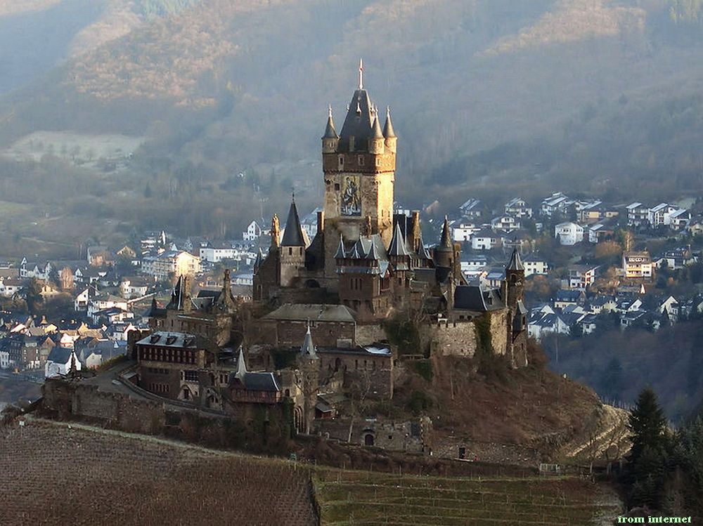 |
| Reichsburg Castle |
 |
| Disneyland's Haunted Mansion |
 |
| "English Tudor Mansion" stock photo from dreamstime.com |
I also wanted to put some more medieval english heritage in there. I looked at the castle towers common in this part of the world.
 |
| Bodium Castle |
 |
| My interpretation of the mansion for use as a background for the GDD |
The game logo, which is just the game's name put in a arty kind of way, was started by me and grandly finished. I started by literally thinking about our title, Southmere. I thought it could be a good idea to put emphasis on the S and M since each will already be emphasised by the reader. I started sketching out ways it could be written in pen, making the S and M bigger, longer with organic but sharp curves. I hoped this would emphasize the horror element of our game. I then decided to draw these two letter to make them more like a spooky, warped tree. I then used a gothic font for the "outh" and "ere".
Quite rightly Jack decided he wanted to have a play around with what I had done to try and add a bit more of the camera. He softened the Ss curves a bit and added a lense in the background.
I am quite happy with the result.

No comments:
Post a Comment