Showing posts with label Concept Art. Show all posts

Wednesday, 10 April 2013

Project StarShip

For this most recent project we were asked to focus on a specialism and produce something that required the use of said specialism. So, I chose design. Design has always been my preferred field in games development. Being involved in another project with the soon-to-be Split Path Studio I also decided to ensure that I focused on areas that would benefit that project too. I chose to produce a complete, understandable and detailed design document for a large scale game whilst producing a prototype for at least one of the core concepts of this game in Unity. In my learning agreement, I made a point to note that this prototype would be rough and would only serve as both an illustration and a way to check how well my ideas work and be able to make informed changes to them.

The idea is to create a Space Adventure game where you play as the captain of your own ship. Many Space Sims and Space RPGs have been created, but non that truly focus on the bond between a captain and their ship. This bond is best illustrated by fictional characters like Dr.Who and his TARDIS, Han Solo and the Millennium Falcon and Captain Mal and Serenity.
The Doctor has a unique relationship with the TARDIS. 


 The character's, even when they aren't necessarily piloting the ship, always command the feeling of ownership over it. As if it is an extension of them. This is a fantasy I want people to be able to experience.

Another game with a very similar concept being it is FTL: Faster Than Light. This was an Indie success on the crowdsourcing site KickStarter, receiving largely good reviews from critics. The game runs on the idea of acting as a commander on a ship, giving orders to the crew and managing the ships systems as they adventure through space. Although this is similar to my idea, FTL took on a much more strategic role I intended to, giving the player a top down view of the ship. My idea focuses heavily of staying in the first person perspective the majority of the time. This makes multitasking much harder but keeps the game personal which is something I'm really trying to emphasize.


A screenshot for FTL: Faster than Light

 There are, however, plenty of things to learn from FTL. For a start the entire game is quick and easy to pick up. After about 20 minutes you have learned everything you need to know about the game. This is extraordinarily fulfilling for the player considering the initial feeling of complexity you receive from the HUD.This complexity is important in making the player feel in control, knowledgeable and in space, it basically helps to immerse the player into the fantasy of being a space commander. This HUD is also made simple to understand by having extremely clear graphics which link everything together visually. On top of this, there are only 3 crucial variables that player is managing at the beginning of the game: Fuel, Hull Integrity and Power. Once mastering these the player can begin to slowly pick up the other variables such as missiles, droid parts, scrap and so on.This can all be easily applied to my game, even if it is first person.
Another thing to consider is it's straight forward story which is simple and guides the player to the end of the game. Get from point A to point B without the fleet catching you. Although you have time to look around, you have very little time to linger and certainly no time to go back. This drives you forward while keeping things simple. It also means forcing the player to make important decisions that they will not be able to go back to and ultimately decide the entire fate of your crew. I like this idea but I do want my game to have a lot of freedom so won't be pushing the player so much in one direction. I do however, want a story that is just as simple and drives the player forward constantly. Although the danger will not be as immediate, it will always be imminent.
One of the games greatest achievements is it's ability to make an interesting narrative out of random events. Since the games story is mostly text based, they can add random events and side quests that have rich and descriptive content while still affecting overall gameplay. For instance, after losing my pilot to a group of Mantis space aliens, who I had to kill by opening the airlock doors, I randomly found a shipwrecked mad man called Charlie on a barren planet who had been living in a cave. Charlie became my new pilot and, being stronger than many of my other crew members, became the last crew member alive later in the game in a Ridley Scott's Alien type scenario. Not only is this narrative terrific fun to describe, it also directly affects gameplay. Events like these are splashed throughout the randomized galaxy just waiting for you to discover them. This is very similar to the feeling I want to put across in my game. These sorts of adventures are perfect for a lone space captain. The biggest problem is, it is unlikely that I will be able to express these events in full 3D. Especially if I want so many. I will have to find a way to make them satisfying, varied, multitudinous and directly affecting play.

Having fully analyzed my competitor, I decided to piece together the idea I had in my head onto paper before refining it into something useable. I want to give the player a fair choice as to how they want to play the game. The current choices stand as Engineer, Pilot, Fighter and Adventurer. Each one, as opposed to being determined by a skill tree or stats, will be determined by skill and how much time a player has poured into practicing that discipline, much like a fighting game such as Street Fighter. The player can also mix and match these "skills" focusing only on one or on all of them as they choose. As such, if there is a leveling system it will be through "examination" type exercises which show that the player possesses a certain amount of skill.
The basic form of play would involve the player wandering around their ship in first person. They will have built the ship themselves, to help emphasize that it is theirs, and they are able to make small level modifications on the fly as they like even customizing the dashboard. Each ship should feel different to fly than any other.

I decided the first thing I should refine is the engineering side of things. This way I know how the ship "works" as it were and can translate that to piloting. So far I have managed to work on a single kind of generator, the Collider generator. I want at least three, each working differently. I am not entirely sure how different as of yet. I am considering creating similar systems for each but requiring different goals. The engineering in the ship works like a puzzle based mini-game. The puzzle has many different "correct" solutions, but some solutions produce more power more efficiently. Players are more than welcome to completely ignore this side of the game, keeping the power at it's default.

The collider system was inspired by a game called SpaceChem in which you must produce molecules by manipulating atoms as they move along a line. Despite these similarities my game is different in 
 all other ways.
A screenshot from SpaceChem


The collider system I created works with "packets"of fuel released by two pumps on either side of a grid. Close to the center of the grid is the collider where two packets of fuel, one from each pump, are collided. The total "mass" and "speed" of these packets equals the power output which can be spread across the ship to power any number of units. The problem is the packets lose mass when the travel 4+ squares and lose speed every time they turn a corner. The player can control the mass and speed by shaping the line leading to the collider, adding special units on the line and using different types of fuel. There will also be obstacles placed around the grid so the designer can control how many variations and what variations are allowed.
An example setup for the Collider Generator.
  This is also the area I have chosen to prototype in Unity. I feel this area is complex and big enough to produce a decent sized prototype, while simple enough to program for a beginner. In order to teach myself Unity, I have been following along with the book Unity 3.X Game Development Essentials. The book teaches the player to create an island where the player must perform specific tasks. I am over halfway through the book, but have already been able to lay down the basics for my Collider Generator. I have used only cubes but can easily replace these with meshes or parent them with textured planes in order to make them look nicer. So far, I have produced a pump, which produces a packet every few seconds and a track which the packet can follow.
Current progress on the Collider Generator prototype.


Thursday, 22 November 2012

Finishing the Design Doc Artwork


The Neutrals
 After the group and I came up with the two different types of ghost. One hostile and on neutral, i.e. indifferent to the player, I realised we didn't have artwork of the latter to show the visual differences. I was aware that it would be vital for it to be immediatly obvious to the player what was a threat and what wasn't. It was the neutrals purpose to loop around a set path, acting out scenes from their past at certain intervals of that path. They therefore need to look human enough to communicate actions. Most of the time they would be faint. If the player looked at them for too long or even got too close, they would simply vanish. It was only at the times they were acting out these highly intense scenes that they could be viewed. They would get clearer, brighter even, and their voices would get less muffled and more audible. I therefore felt i should try to show both states of neutral. 
The ghost I designed was based off of a ghost that lived in a pub close to my home in Canterbury called the George. Despite not believing in ghosts I still find these stories interesting. The pub had several fleeting owners on my frequent visits to it as a child (it was a family friendly country pub), some of which were believers and actually had exorcisms performed on the building, some were non-believers. They all, regardless of their beliefs, experienced at least the feeling of a "presence", some even claimed to witness the ghost. She was "The White Lady" a woman in her nighty wander what was once a much bigger building. I based her appearance off of some of the old photos showing ghostly white figures.
The Brown Lady of  Raynham Hall, 1936
 These are often faded, white figures with barely discernible features. When in her, higher emotional state I also wanted her to glow. I thought it a good idea to have her glow a colour that showed the emotion she was feeling. In this case fear is represented by yellow. I also wanted to put a little storytelling into the pictures. I added an oil lamp which she would be carrying as she wandered the halls of where ever. This could be dropped and smashed in her fearful pose. Showing a flow from one to the other.
The neutral ghosts: Normal on the left, Emotional on the right
.
    The Inventory
After some discussion with the group I was assigned the task of designing the inventory. We had already agreed that Anne would keep all of the items she found in a tan leather messenger bag she carried around with her. I decided to create the inventory around these principals. I also knew that there were only 4 types of things Anne could collect: Batteries for the camera, and indication for which had already been designed by Jack, Film, Puzzle items and Combo items, which attach to combination film.
As such I created seperate areas for each. I also wanted it to look as though she was looking into her bag. Based on this principal I thought it suitable to have the items in a line with a circle around the selected item. The items would fade out and get smaller as they moved away from the circle. This gives the impression that they are disappearing into the bag. I have designed the information box at the bottom of the box to look like a piece of torn notebook paper since the other menus are all based in a journal Anne carries around with her.
My design for the inventory. Background provided by Jack

The piece was all drawn with little reference needed. I drew mainly from intuition. The only problems I have with it is the general roughness of it and the cartoony shades of colour. I feel like these could have been desaturated and even given a hint of blue to go with the gloomy cold feeling of the rest of the game.
 
Mansion
I originally intended to have the backing for the Design Doc to look like the scrappy notebook Anne carries throughout the game, the group disagreed, however, and I was instructed to create a scene which could have the opacity lowered.
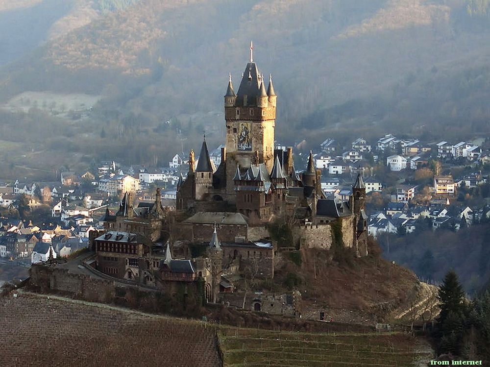
I thought, since the Mansion is the primary incentive for the player and it had not yet been designed, I should maybe produce a scene with the Mansion in it. Not being great at drawing buildings I needed a fair amount of reference. I thought about how the village was supposed to have survived for centuries. The village was also the scene for a horror game so had probably seen some pretty horrible history. Many of the locations in horror have history beyond their main story. I figured that it was probably a castle at one point belonging to a land baron at some point. I also then found that British castle architecture just isn't that scary. I decided, since we weren't going for an entirely realistic approach to sneak in a little of Reichsburg castle into the central tower.
Reichsburg Castle
I also wanted some of the more traditional spooky house look to it. Unfortunatly, not much Englishness to draw from here. So I decided to look towards some more American influences, taking note of some of the roof designs and the way parts of the building from Disneyland's Haunted Mansion
Disneyland's Haunted Mansion
Noting a definitely unbritish feel to the whole thing I decided to throw in some Tudor, taking particular notice of the beams.
"English Tudor Mansion" stock photo from dreamstime.com

I also wanted to put some more medieval english heritage in there. I looked at the castle towers common in this part of the world.
Bodium Castle
The final result was a sort of Frankenstein's monster of stitched together architecture. I also realised that this wasn't necessarily a bad thing in a horror game. I painted most of it in monochrome blue, wanting to give the whole thing a cold, unforgiving look. I did, however, give a slight orange glow from the windows. This is to give incentive to the player to move towards it. I don't think I really pulled it off. Still, did my best. I also think my edges need to be sharper, my perspective more precise and just about everything else. All of which could have been improved with more time and practice with the references.
My interpretation of the mansion for use as a background for the GDD
Logo
The game logo, which is just the game's name put in a arty kind of way, was started by me and grandly finished. I started by literally thinking about our title, Southmere. I thought it could be a good idea to put emphasis on the S and M since each will already be emphasised by the reader. I started sketching out ways it could be written in pen, making the S and M bigger, longer with organic but sharp curves. I hoped this would emphasize the horror element of our game. I then decided to draw these two letter to make them more like a spooky, warped tree. I then used a gothic font for the "outh" and "ere".
Quite rightly Jack decided he wanted to have a play around with what I had done to try and add a bit more of the camera. He softened the Ss curves a bit and added a lense in the background.
I am quite happy with the result.

Saturday, 10 November 2012

Finalising the Ghosts and Creating James

After finishing the ghost silhouettes me and the group agreed that the "Hanged Man" (Number 2) and "Jimmy Squarefoot" were the strongest and were the most worthy of further development. Those 2 enemies would get a full written profile and a visual touch up. After researching how to make the ghosts look more ethereal.
After some research I found this painting of a ghost ship and found that light desaturated blues worked well for the job I wanted to perform. The first iteration of the Jimmy and the hanged man came out way too blue. Although they looked like ghosts, they looked like they were from Scooby-Doo or some other cheesy interpretation of a ghost. This isn't exactly the sort of look I wanted my ghosts to have. The group also made the point of saying that they wanted some indication of colour rather than plain monochrome. I argued that too much colour would make the ghosts look too solid and less ethereal. I managed to find a comprise point however by adding a low ocapicity layer with some basic colour over the top.
The Hanged Man
Jimmy Squarefoot
After this my next job was to create the secondary character, James. As a group we had decided that he would have been close to figuring out the cause of the supernatural happenings in the village 200 years ago when it all started. He was killed during these events and had come back as a ghost to use Anne to interact with the world in the ways he cannot. He convinces her that he is a medium. This serves as a way of explaining his supernatural abilities.
For the modern version of James, Juliette suggested this suit:
With this coat:
For his hair I wanted to give him something that could work for a modern medium and a Victorian academic. I chose to replicate, more or less, Oscar Wilde's hair.
I'm not overly happy with the final result. I felt they were under researched and that I didn't spend enough time on them.
Modern James

I think the face is a little unrealistic and under developed, especially when compared to Anne. Regardless of this I have had to leave it (for now) due to time constraints.
I have very similar critical views on the Victorian version of James. I chose this outfit:

Again I do not think this is nearly as refined as it should be I would like to preferably redo the design if time permits.

Having finished with the visual work I wanted to work on the character profiles. The original profile for the main character the thought was too dramatic and gave her too much character. After a discussion with our tutor Matt I realised that the main character should be more of a "blank slate". I did this by leaving a lot of details out of her life and giving her a very basic motivation. She is a journalist trying to prove herself by investigating the village.
James has a bit more of a complex history. The group seemed to disagree with James being a journalist too. I found the best 19th century occupation for him was that of an academic studying natural philosophy. In his search for natural answers to the events in the village, he finds that the only answers available are far from natural.

The next profiles I was required to write were the enemy profiles. I didn't seem to get much resistance on this and feel more than happy that my stories and designs work well for our game.


Monday, 29 October 2012

Creating Ghosts

One of my roles in the group was to design the enemies for the game. Although the majority of the design and its connectivity with the rest of the game is left to group meetings, I still deal with the smaller details and the individual visual design, story background and mechanics each one works by. I decided to start off with the visual designs.
We all agreed upon how the enemies would work. Each and every enemy would have AI that allowed them to follow you and hide from you. Although we haven't quite decided how the enemies would hide from you, we have pretty much agreed that they should be invisible for the most part. You would be alerted to their presence through the appearance of frost or icy breath. You would see their location from paper moving, wet footprints and clever sound design. We also discussed how enemies would only become visible just before you catch them.
With this in mind I wanted each enemy to be unique. Having hordes of copied and pasted zombies or enemies may be good for an action game, but for a horror where you don't need hordes of enemies you only need a few, if not one. This means you can give it a backstory and it's own way of moving. Since our game is split into multi-linear side quests that eventually link with a main story arc. Each story can have anywhere between 1 to 3 enemies. Enemies cannot be killed/exorcised without completing the story they are linked with. The only way to repel them is to use the camera flash. This uses up your limited supply of battery and will merely buy you time.
Since all the enemies are unique and have a fairly simple way of repelling them, I can make each one wildly different from each other. When I was developing the main character I had a fairly strong idea of what I wanted her to look like so developed her by layering sketch over sketch until I had one I wanted to work on and paint. With enemies the wide variety and strong visual element led me to use the silhouette method to design 6 different ghosts, then allowing the group to pick two to develop further. Because of this method each enemy would be instantly recognizable and have a strong visual starting point for further development. I used a tutorial by the concept artist Feng Zhu as a base for the technique I used.
This gave me a very good idea of what I was doing. An especially useful piece of advice this tut gave me was that I should keep everyone different from the next with enough detail that a good 3D artist could create a model just from that silhouette.
In my search for inspiration I borrowed two books from the Norwich Forum Library: The Most Amazing Haunted Places in Britain (Readers Digest, 2009) and The Encyclopedia of Ghosts and Spirits (Guiley. Rosemary Ellen, 2000 2nd Edition). The former wasn't particularly useful simply because the stories were too brief to give a real visual feel for the ghosts. The latter aloud me to look up obscure spirits and stories which lead to almost indirect inspiration. After spending a couple of hours reading this book, I found that everyday things would naturally form the idea of a ghost in my head. Most of the ghosts, however, take very indirect and subtle influence from many places.
The ghost silhouettes with colour added to any that I want to draw particular attention to.
  1. This design was based loosely off of "The Skullkid" from the Legend of Zelda series (Nintendo, 1986).
SkullKid from the Zelda series
The character is a young boy who carries a butchers cleaver and wears a ironically cheerful mask. He is lost in a perpetual game of hide and seek meets tag. He will deliberatly hide in rooms waiting for you to come close and face away. He then creeps up and takes you. The idea being that he will give clues as to his rough location by singing or appearing in front of you briefly. You must then try to deduce where exactly he is hiding and flash him with the camera so that he cannot get you.

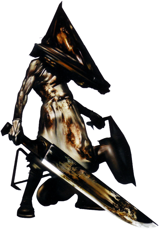
2. The "Hanged Man" was just an idea I had in my head and decided to work upon. A part of this was the idea of Pyramid Head from Silent Hill 2 (Konami, 2001). The idea of an enemy that drags himself around shows both agony and the anger and vengeance to force himself to continue to drag it.
Pyramid Head from Silent Hill 2
The Hanged Man drags the beams from the gallows around with him with the noose still around his neck. Clues to his location are given from the sounds of dragging and chocking noises. Despite being slow, he can throw the beams of the gallows at you, knocking you onto the floor preventing you from snapping him with the camera. He can easily be outrun, but he can try to anticipate your path and try to cut you off or trap you.

3. This character is based on a section on Hermitage Castle in The Encyclopedia of Ghosts and Spirits (p181). This article mentions an evil lord, Lord Soulis, who was bound in a lead sheet and chains and then boiled alive. He is an alternative to the hanged man. He behaves in much the same way, dragging around his ball and chain.

4. The drowned woman has very little direct influence, rather an "organic" idea. She appears as a pool of water which runs like normal water. She can drag herself half out of the water and slowly drag the pool around. She can also appear out of existing pools of water. This means the player should avoid water and run away from any moving pools. The only clues to her arrival is the pool she dwells in.

5. Based more directly off of an article from The Encyclopedia of Ghosts and Spirits (p201), Jimmy Squarefoot. Jimmy Squarefoot is a spirit that has a pigs head and wanders the earth on square peg shoes. I decided that this was too "otherwordly" and instead had the idea of a butcher who was murdered by being shoved into the front half of a pig and choking on pigs blood. The ghost moves like a giant boar. It will charge you extremely quickly. It will be invisible but give off visual and audio clues as to it's location such as dust trails and stamping. This will give you a chance to flash it with the camera before it hits you.

6. The Old Hag is something I have known about for a long time from no specific source. The old hag is a fairly common dream shared by many people for a long period of history. The Old Hag is a nightmare. The dreamer first experiences sleep paralysis where they are aware but cannot move. They then see an old hag in the corner of the room who slowly approaches the bed. The old hag then slowly climbs onto the dreamers chest and strangles them. This will be difficult to implement into gameplay but will be interesting if we do.
A painting of the old hag dream


Monday, 22 October 2012

Fatal Frame 2; Reimagination

After meeting with the group we have finally began to string together a rough structure for our re-imagining of Fatal Frame II. We have not yet decided on third or first person gameplay, but we are leaning toward third to keep the gameplay a little closer to the game that inspired ours. Although we have not settled on an exact location, we have decided that, like the original our game will take place in an abandoned village. Ours, however, will be European.We want to keep the focus on one character but have another character to drive the story along and give the players an emotional connection to what's happening in the game. This echoes back to fatal frame two where the story revolves around two twins. However, we want the game to include extra mechanics with this extra person, e.g. the other person can reach places the main character cannot.
After a meeting with one of the tutors, we came up with the idea of using a sort of early warning system for the presence of ghosts, much like the radio in the Silent Hill (Konami, 1999) games. Our idea is to use frost and icy breath based on reports of ghost encounters. The enemies will be made up entirely of AI controlled ghosts. The AI control will allow the ghosts to act independently, hopefully producing unpredictable and scarier experiences. The ghosts will not be visible most of the time, hiding in shadow only revealing itself just before attacking. There will, however, be clues as to where it is. The player will be armed with a Polaroid camera which will both repel ghosts from attacking and allow the player to solve puzzles by showing items and clues that are visible only on film, this could include items that belonged to the ghost which are no longer there. The game will take place over one long night in the village in which the main character and their companion is trapped. The player will move from location to location solving dynamic puzzles in order to resolve the dead's unfinished business. This will "exorcise" the ghost and open new doors to the player, allowing them to go deeper into the village.
First sketch
After the meeting we split the labor between us.Jack took settings and items, Juliette took game mechanics and I took enemies and characters. The image I had in my head was of a strong but perhaps emotionally vulnerable. We all knew we wanted to make her a reporter, so, I initially gave her a shirt and jeans. I wanted her to look interesting so gave her a rigid nose to make her a little less pretty. The reason for this being, if a character is too good looking I think it can take away from their character.I coloured the initial sketch in order to start a more active dialogue with the group about changes. The group told me that the hair was a little too "piratey" and the nose need to be fixed. They also told me the jeans were too flared and needed to be straightened. Juliette also gave the suggestion that I should give her a cardigan.
Final iteration
The final iteration took all of these suggestions into account. I have to say that I do prefer her after making the suggested changes. Despite this, I feel like I should have gotten a lot further with the design than I did. I had the intention of turning it into a full painting with no linework. However, I found that, due to my fairly low skill level, it took me way longer than I feel it should have to get this far. I am very eager to improve my drawing skills. Although I do not want to be a games designer, which does not necessarily require good drawing skills, I do enjoy getting my ideas out in this way. 
 
I am currently working on a personal profile for her. I have been trying to work out a history alongside her personality so I can almost let her flaws and qualities shape themselves. The current profile is as follows:
 
Name: Kate/Anne
Age: 23
Gender: F
Occupation: Journalist
 
History
  • Born to a well off supportive family. Lost them in suspicious circumstances, drowning or similar (The disturbing past is important as it adds depth by giving meaning to her flaws). This will have happened at around 10 years old (too young without any consistent authority figures and/or caregivers and she is likely to develop psychopathic tendencies, this is not a good hero character)  She will have lived in the countryside.
  • Upon the death of her parents she moved into an orphanage where she struggle with the death of her parents by turning to delinquency, even running away a few times (this is a good device to introduce new flaws or elements in her past like drugs and violence if required). In her mid teens she is given a new tutor who is both kind and commanding and gives her a new parent figure. Her tutor introduces her to literature.
  • Inspired by the stories and writings she has recently been introduced to, she decides to become a recognized writer. Under the guidance of her tutor, her grade slowly increase and she gains her degree from a decent university. Her writings are found by a large, national newspaper and she takes a job as a small columnist. 
  • After a lot of hard work she is given a big investigative piece to prove herself. The case of the lost village...
Personality Traits
  • Outwardly resilient and strong
  • Inwardly insecure 
  • Driven (As a way of proving her insecurities false to herself) 
  • Difficulty with attachment and trust
  • A good but often dark/bitter sense of humour
  • Slight tomboy 


Thursday, 26 April 2012

Finishing the Homeless Survivor

After figuring out a good painting technique whilst designing my Kokiri Door I decided to use the same technique. Using a chalk brushe with varying opacity I bagan adding tone to my homeless survivor. Not having a lot of time left to finish my paintings I didn't get the chance to add much more to the "after" picture to suggest he had been through an apocalypse. As I finished up the after picture I realised how little time I had left and had to tine the pile of corpse he was sitting on in order to blend properly.

I would have liked a lot more time on this. However, I feel doing this on a short deadline is pretty much the point. I also feel like I need to improve my knowledge of lighting and colour a lot more. I don't things the forms themselves are as disastrous as they could have been, but I think I do need to draw a lot more fabric and develop a style to draw people with, making it easier to draw them quickly.

Tuesday, 24 April 2012

Finally finished the design

After doing what I felt was enough studies to produce some actual designs, I jumped right in and painted a 3/4 view of the Kokiri door.
3/4 full concept for Kokiri door
After doing a rough linework layer based on the sketches shown in the last post, I began blocking in the basic colours with round hard edged brush. The colours I chose were based on the general desaturated look the Kokiri forest has in the game.
The colour and texture of the door was taken from the Kokiri shield, appearing to be made of bark from the Deku tree. A sacred tree to the deku people.
I also noticed that the symbol of the shield roughly represents the letter Y. It is for this reason I chose to draw the letter F with a similar organic swirl to it.
The single leaf that hangs of the side of the tree acts as a call back to the large leaves atop each Kokiri house.
The vines and toadstools were put it to give the image a more "fairy forest" feel. Although the "Fly Agaric" mushrooms were chosen for their bright red and white colour which adds a complimentary splash of saturation to the painting.

Once I had all of the elements I needed in the painting, I took a chalk brush with a low opacity and added tone to the image, building up the tone over time, blending as I went.

Now that I had a more detailed painting with a bit more texture, I felt I could be a bit more rough with the orthographic designs, keeping the linework in and only adding enough tone to define the shape.
The back of the model wont be over detailed. It will only show the opening in the roots that the door covers and the texture of the inside wall of the tree.

Sunday, 22 April 2012

Character of the Week: Horror Survivor Progress

After creating my rough line work I wanted to work a little more on the face. The face in the before image was a little too flat, I wanted to turn his head a little to give it a bit more dimension.
I used images like the one above as reference to give him the right run down look. I then added some basic colour to him. I then went on to straighten up the After picture.
Although I am happy with the pose, I feel like I should add some more evidence that the man has just survived a zombie apocalypse. His clothes have not changed, and the only real differences in his appearance are that his hair has been tied back and he is holding an axe and zombie head. I want to add more evidence of what happened to him in his clothing and general appearance.
I will go over the linework, adding a bit more detail before beginning to work entirely in colour.

Thursday, 19 April 2012

ConceptArt.org's Character of the Week: Horror Survivor

Failing to get the Armed & Dangerous project done on time, I decided to do another competition whilst still finishing up my Armed and Dangerous Character. The competition I chose was the Character of the Week competition on ConceptArt.org which forces me to work to a brief on a tight deadline, clearly something I need to improve upon. The deadline for this competition is the 22nd of April.
The brief of this weeks competition is to create a character that has just survived Horror film-like circumstances. You must show them before and after the event. My idea was to have an old homeless man who would profit from the unattended shops and homes, providing he can survive the zombie horde. The first thing I did was to scour google images to find images of homeless bearded men as reference. I then created this rough and initial sketch.
I want to try and get the "before" image at a less orthographic angle. At the moment he looks a bit too 2d. The one on the right is good for pose and silouette, but I feel I could add a few more token of what he has been through. On the left, similarly I feel I should add a few token of who he was (can of Special Brew, hat for change, etc.).
Once I have the silouette and outline sorted I will try to add some block values before moving onto colour.